
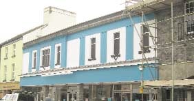
THE former Woolworths building in Tavistock has a bright new look — but the colour has left many people feeling blue!
The electric blue facade of Fashion Direct's store in Duke Street has not gone down well with shoppers and town leaders, who have used words such as 'vulgar', 'garish' and 'tacky' to describe the store's corporate colour.
They say it is out of keeping in a conservation area, where many of the buildings are listed, and Tavistock's olde worlde appeal.
But the owners, who are entitled to paint the shop whatever colour they like because it is not Listed, say with all the doom and gloom around, a bit of brightness should be welcomed.




Gilian Bassett from Whitchurch said it was a 'monstrous carbuncle': 'It's so bright it must surely be seen from outer space.
'Whatever possessed the proprietors of this business to indulge in such vulgarity in the best market town in the country.
'A well run business doesn't need to draw attention to itself in this way. Let us hope no-one else in Tavistock follows suit — but I don't think anyone else would want to spoil the town.'
Mayor of the town Mandy Govier has even joined the debate: 'It's hideous. Everywhere I go people are complaining to me about it. It is dreadful and not in keeping with Tavistock town centre at all.
'I do not think people will ever get used to it.
'I think it has cheapened the area and looks tacky.'
Former mayor and member of the old Tavistock Civic Society, Judith Williams, said blue may be Fashion Direct's corporate colour, but the firm's shop in West Street was not as 'over the top'.
'There is some blue on the other shop, like on the sign, but not on the whole lot,' she said.
'Some of the plaster could have been picked out in blue but as it is, it stands out in a predominately grey environment.'
The objections to the colour seem to be across the board with many children and young people not happy. But 15-year-old Chelsea Hobden and her friends from Tavistock College took a different view: 'I think it is eye-catching and it's a change to all the normal colours everybody else has.'
Louise Rice said she was not concerned about the colour — it was just nice to see the heart of Tavistock back again: 'It's such a big shop and to see it empty was depressing,' she said.
Owner of Fashion Direct Nigel Kingscott said the shop was painted in the company's corporate colours.
'With all the doom and gloom around we need a bit of brightness. Surely there are more important things in the world than the colour of a shop?'
Tavistock's main thoroughfare could see more changes soon, as the Cornish Oggy Oggy Pasty Shop has applied for planning permission to move into the old Kivells office in Brook Street — West Devon Borough Council has received 39 objections to this plan, including one from Tavistock Town Council.
And Hunstrete Estates is seeking approval, once again, to demolish the former Old Folk's Rest Room and replace it with a shop unit.
Colour psychologist Angela Wright, who knows Tavistock well, said this shade of blue would be a great colour in Southern Europe, where there were other properties in bright colours, but it was out of harmony with the muted colours of the shops in Tavistock.
'It is not so much the colour itself but it is the wrong blue to put anywhere near the kind of yellow next door — it completely clashes,' she said.
Blue was the colour of the mind and it encouraged thought, said the colour expert: 'Blue helps people to focus the mind but there is a bit too much of it here to do that. Softer blue is the colour of concentration and shows something has been properly thought through. But if you get it wrong it can be a mental strain and unfriendly and unemotional.
'The intensity of the colour of the new store is quite a negative contribution to the beautiful town of Tavistock.'
Angela Wright is the founder of Colour Affects, which advises people in business about the effects of colour.
Comments
This article has no comments yet. Be the first to leave a comment.